Today’s theme is Color Schemes That Promote Harmony. Step into a calm, creative space where balanced palettes soothe the eye, soften the mood, and make every design choice feel intentional and kind. Stay awhile, share your palette experiments, and subscribe for weekly harmony prompts.
Why Harmony Matters in Color
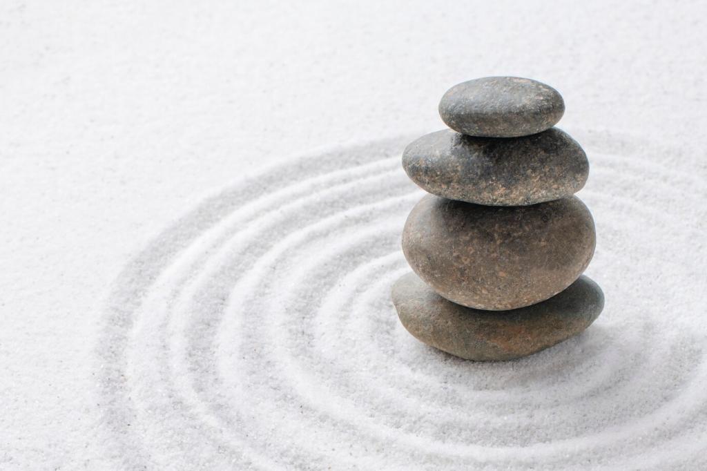
Our visual system relaxes when hues share relationships that feel predictable, like close neighbors on the color wheel. Lower chroma, softened contrast, and consistent temperature cues reduce strain, letting the brain focus on meaning rather than wrestling with stimulation.
Analogous, Monochromatic, And Nuanced Neutrals
Select three neighboring hues—like blue, blue-green, and green—then vary lightness to create depth. This approach mirrors gentle environmental gradients, such as a shoreline, delivering cohesion without monotony. Try it on dashboards or living rooms for immediate serenity.
Analogous, Monochromatic, And Nuanced Neutrals
Choose one hue and explore tints, tones, and shades. Texture and value changes maintain interest while preserving unity. Designers love monochrome for branding systems where hierarchy is critical, yet the overall feeling must remain grounded and consistent.
Mute One Side For Grace
Take a strong blue-orange pair and reduce saturation on the orange while slightly lightening the blue. You’ll keep vibrancy but lose harshness. This tactic works beautifully for calls to action that feel friendly instead of demanding attention.
Choose a main hue, then select the two neighbors opposite it. A teal primary with accents of soft coral and muted saffron delivers movement without conflict. Use the 60–30–10 ratio to distribute dominance, support, and accent with elegant clarity.
Build from deep pine to moss to lichen, with warm bark neutrals for balance. The progression creates distance and gentle contrast. Designers report fewer revisions when clients recognize these familiar, comforting relationships from everyday walks and memories.
Move from slate sky to sea-glass teal to foamy off-white. Slight desaturation mirrors misty air and reduces glare on screens. Try it for wellness apps or quiet retail interiors where the goal is clarity without sterile coldness.
Soft peaches, burnished ambers, and dusty violets replicate sunset cohesion. These colors flatter skin tones and product photography. Share your favorite golden hour snapshot, and we’ll help extract a calming palette for your next project or room refresh.
Red can celebrate or warn, depending on region and setting. When in doubt, soften saturation, lean on contextual neutrals, and validate with local feedback. Ask your audience what feels respectful, then refine without abandoning the harmony you’ve built.
Harmony Across Cultures And Contexts
The same palette shifts under warm bulbs, daylight, or OLED screens. Test swatches across environments and materials. Photograph samples at morning and evening to catch temperature drift, then nudge values until the combination stays calm across conditions.